Sahm Studio
A refined identity for an architectural design studio: a precise wordmark, a forward-motion arrow mark and a calm teal-on-ink system that signals craft and direction.
Sahm needed a brand as considered as its architecture. We built a refined visual identity around a precise wordmark and a distinctive arrow mark, ready to apply across signage, print and digital.
Architecture studios often look either cold or interchangeable. Sahm needed an identity that felt precise and modern but still warm and human, confident enough to signal craft without feeling clinical.
- Brand identity and wordmark
- Forward-motion arrow mark
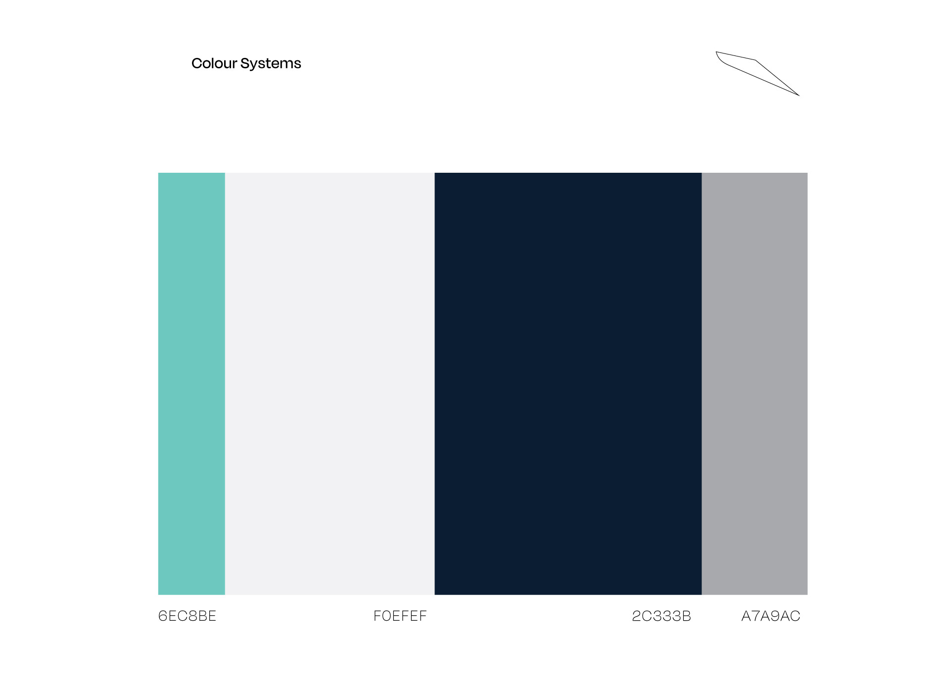
- Colour palette and typographic system
- Signage and environmental applications
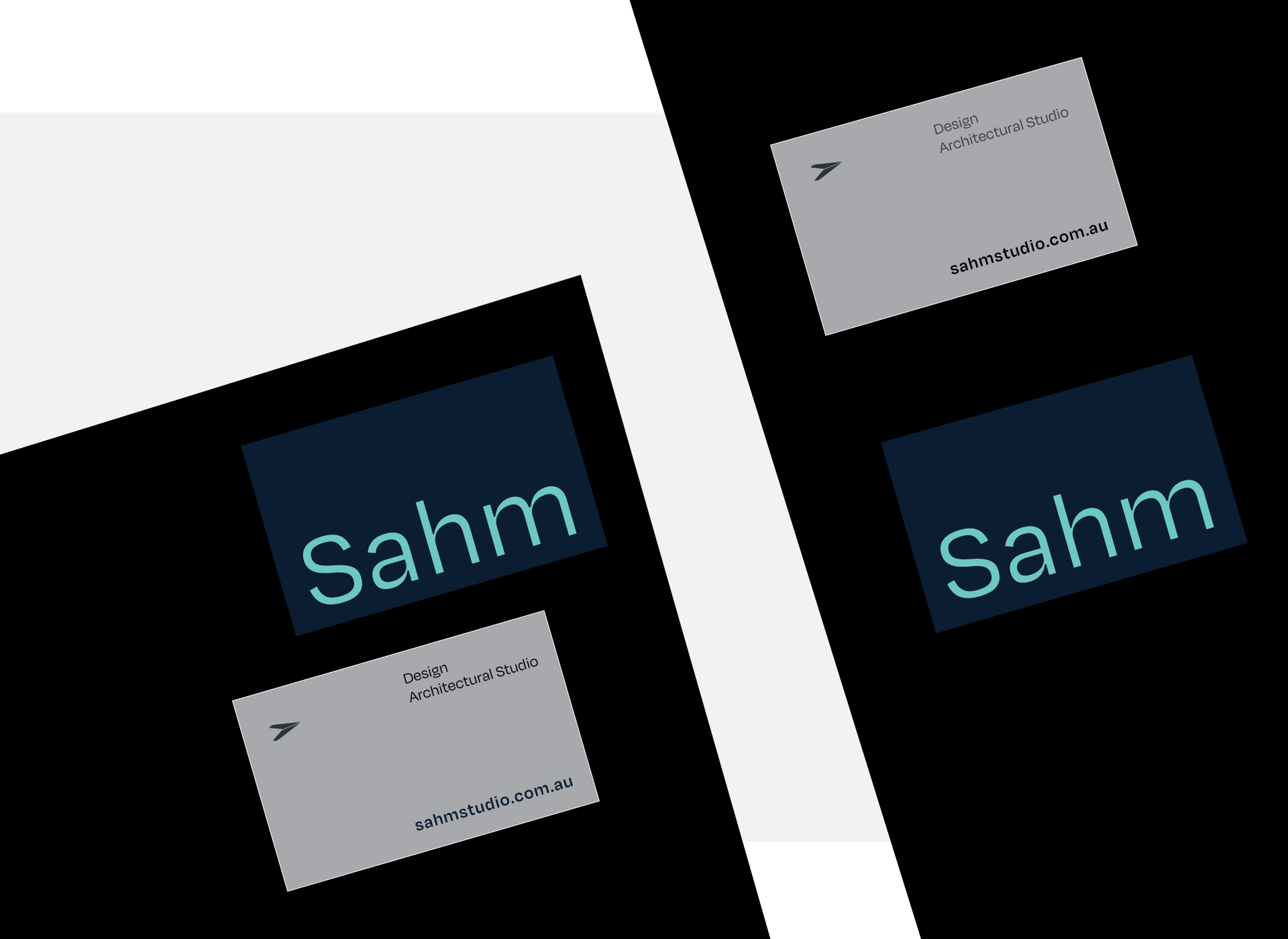
- Print and digital collateral
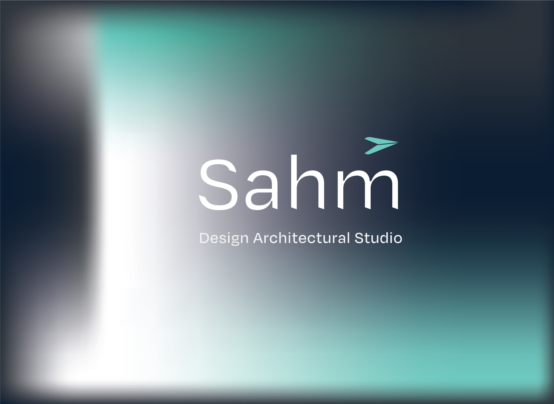
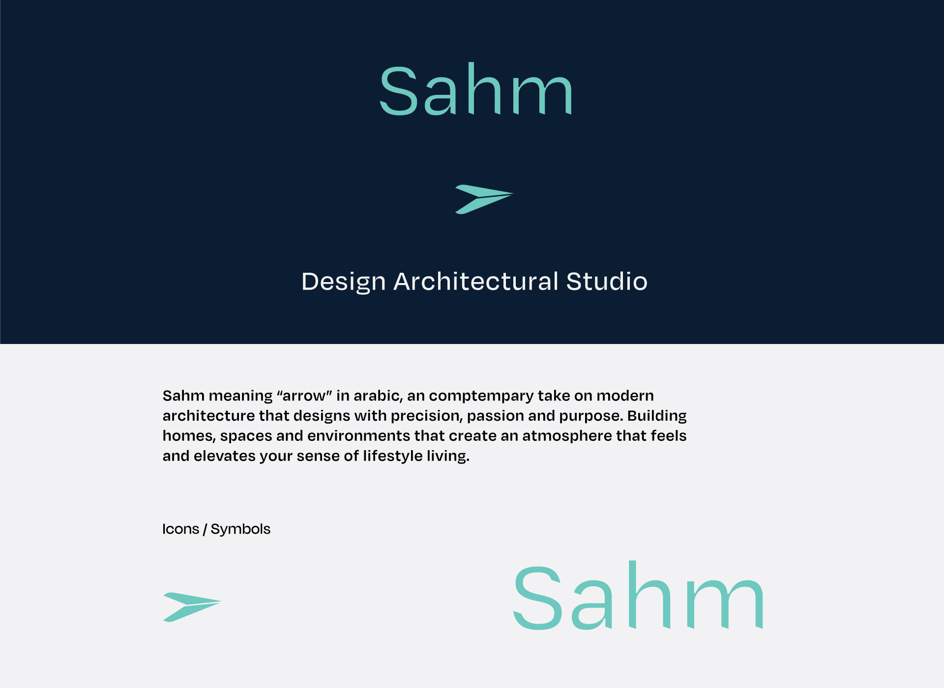
A refined system: a precise lowercase wordmark anchored by a teal arrow mark, set against deep ink and soft gradient backdrops. Calm, modern and directional, with a real sense of momentum.
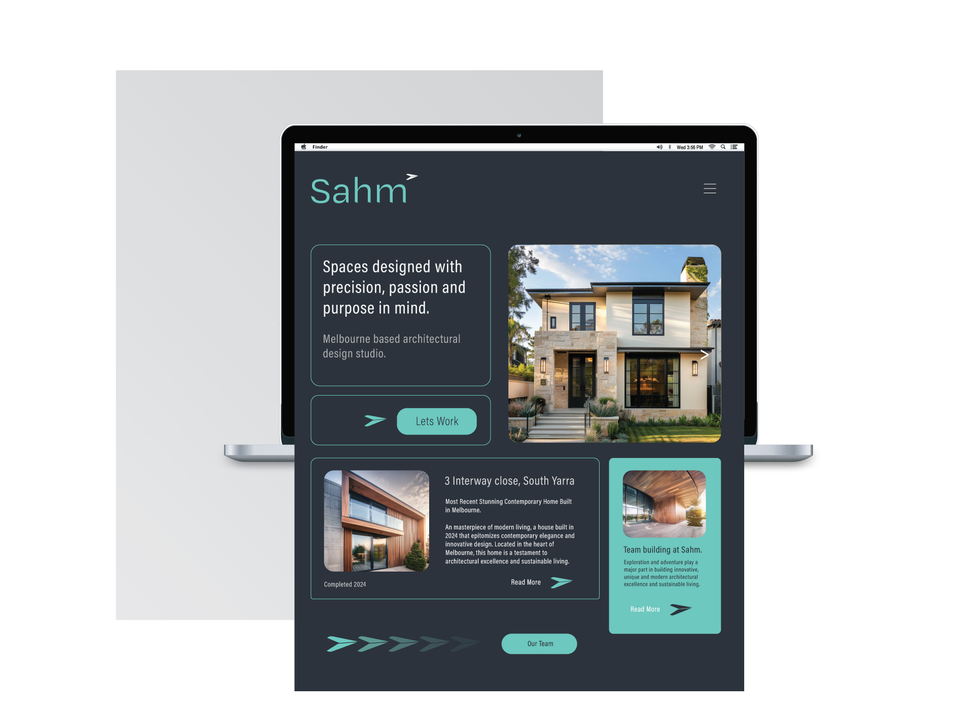
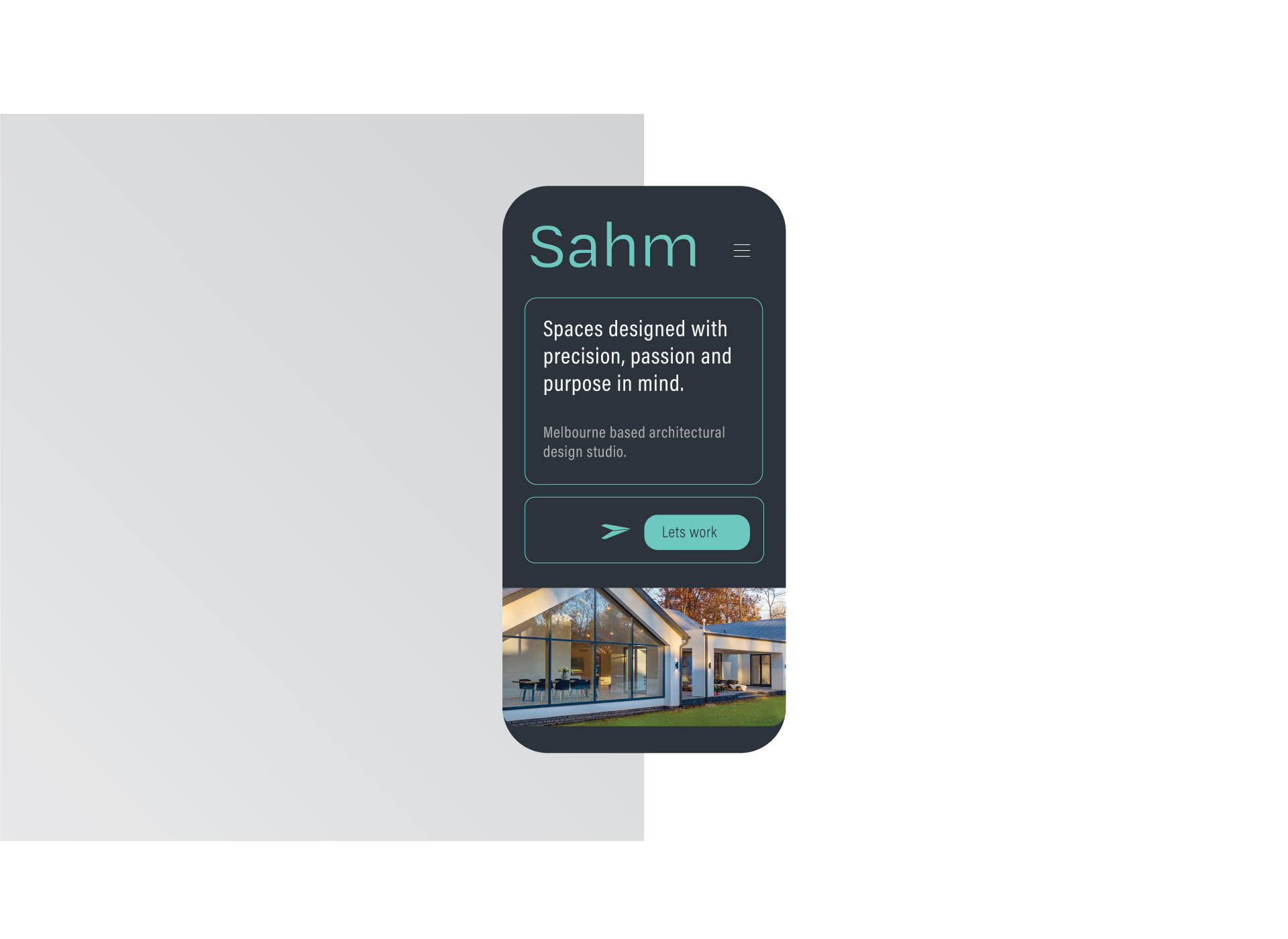
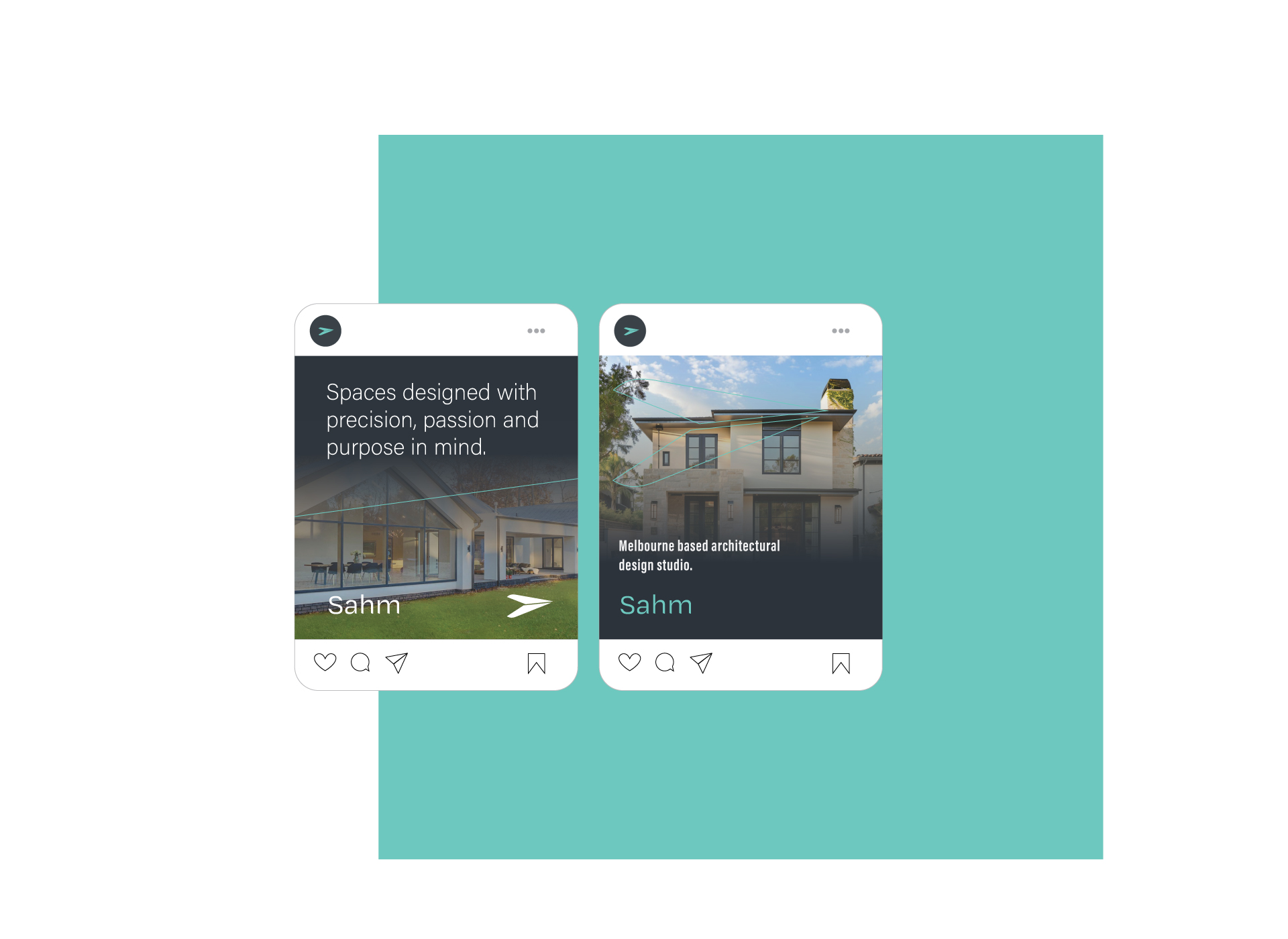
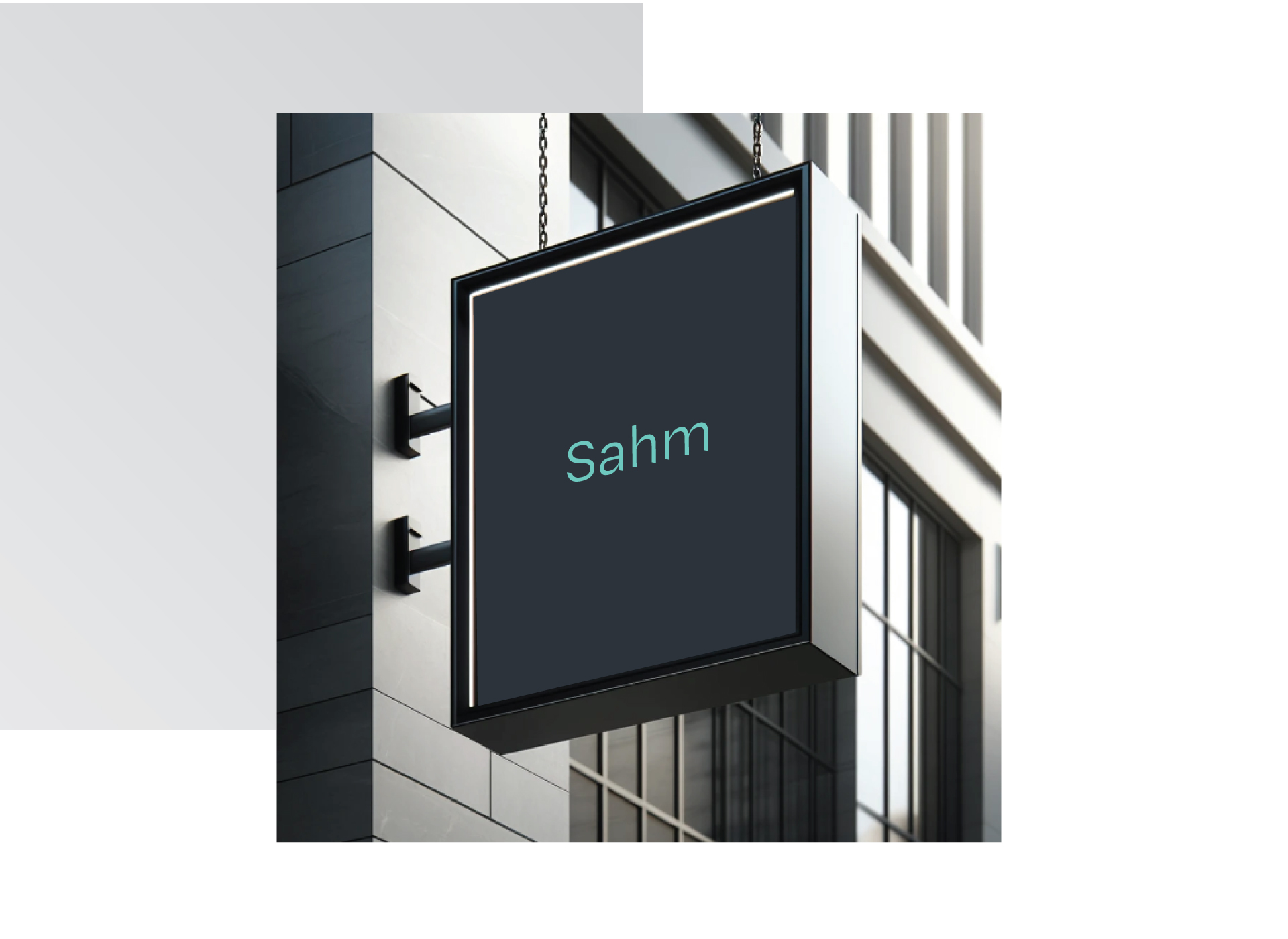
A polished architectural brand that reads as precise, modern and human, and rolls out cleanly across signage, print and digital.
Visit SignSpot, our dedicated signage brand for vehicle signage, shopfront signage, window graphics and commercial signage.
Visit SignSpotLet’s build your brand next.
Tell us about your business and what you’re trying to launch. Or email sales@vividicon.co.nz.
Or email sales@vividicon.co.nz